Form design best practices
Learn how to improve the design of digital forms

These best practices serve to provide a shorthand when designing forms. Make sure to always keep in mind your context to determine the best presentation. Like most things in design, there are often exceptions to best practices.
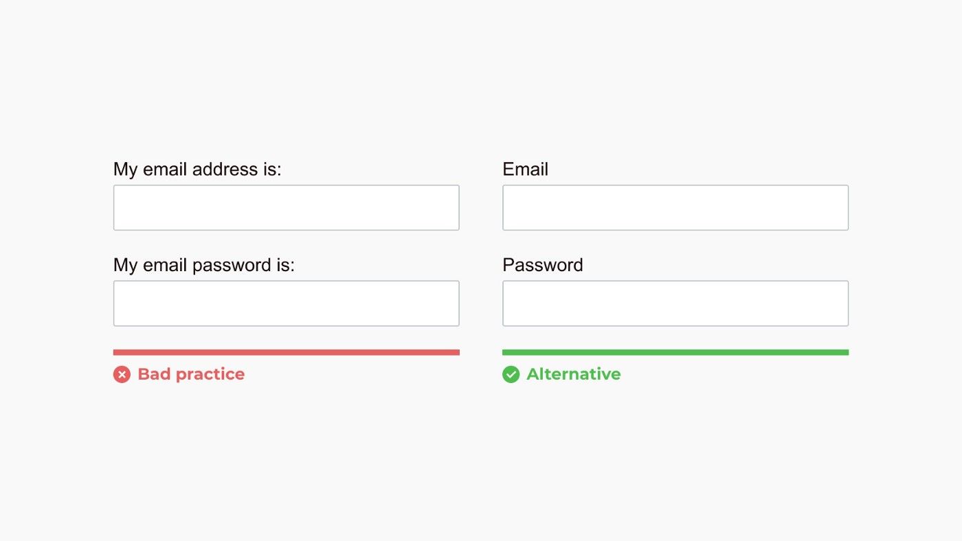
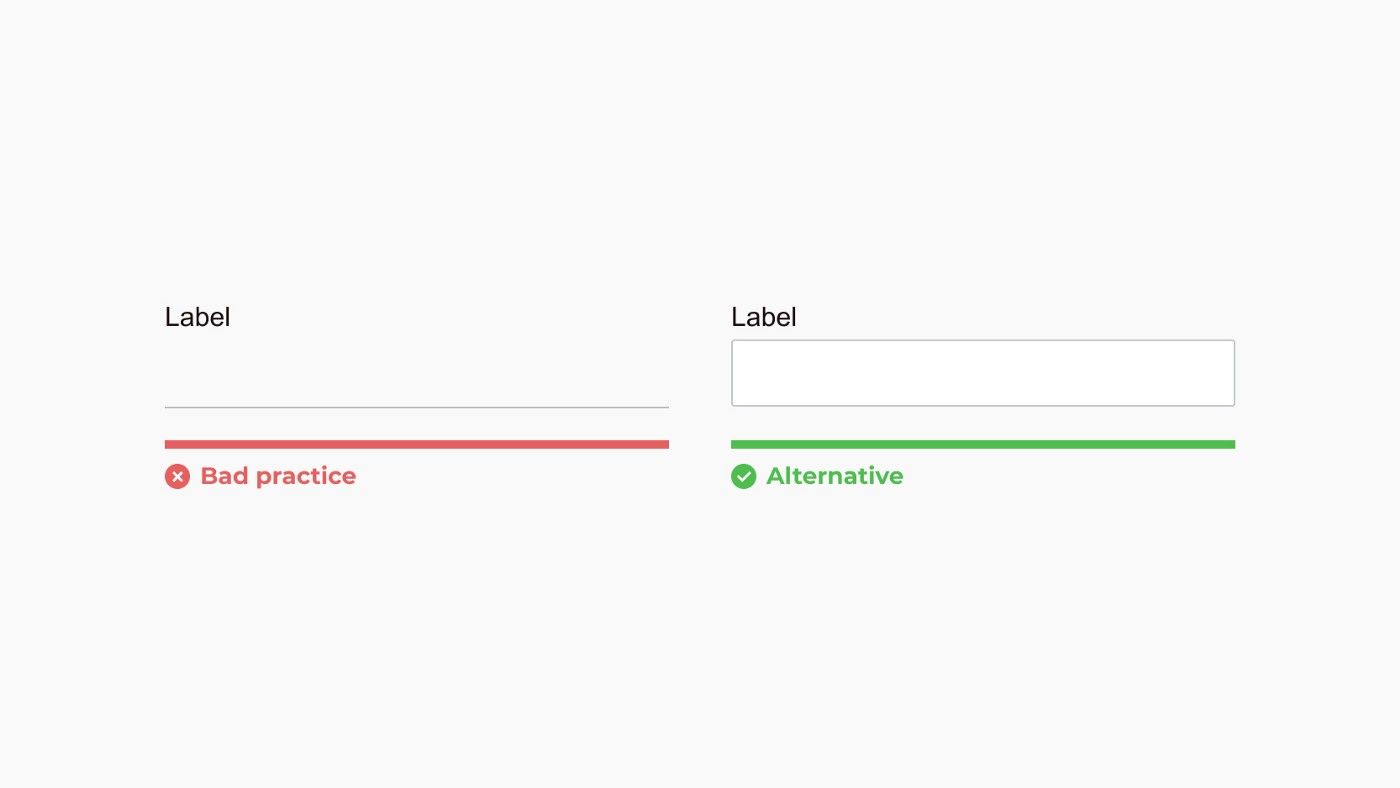
Use a label

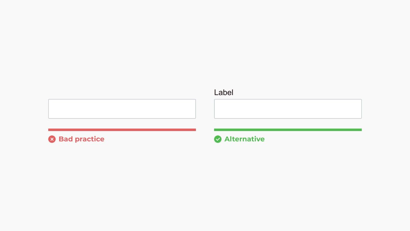
Labels are imperative for accessibility. Screen readers communicate each label to users. Without proper labeling, forms are inaccessible to many people. Make sure every form field has a
Avoid placeholders as a label
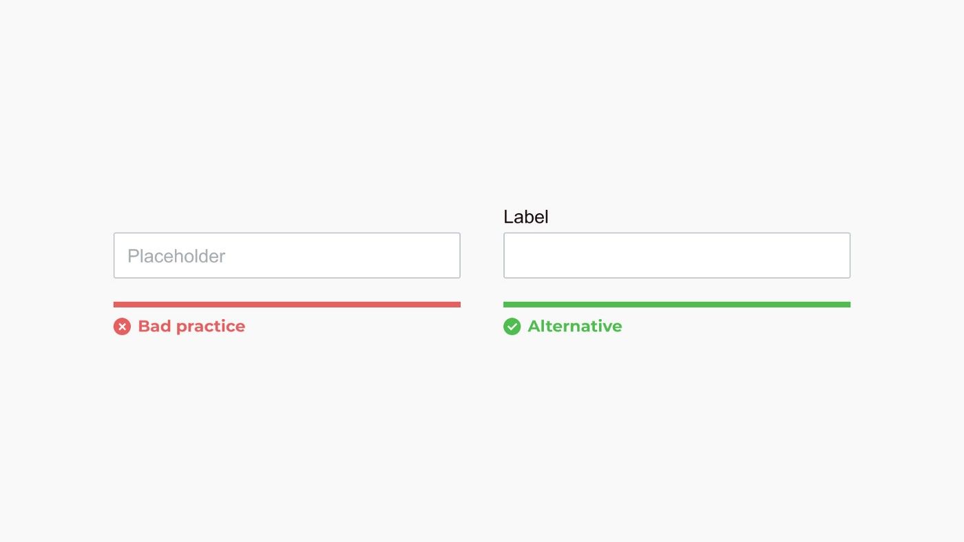
Using a placeholder as a label puts a burden on short-term memory. The label disappears as soon as the user starts typing, and the user must clear input text to expose the placeholder label again.
Placeholders create additional issues when they are too light or dark. When too dark, the placeholder can be mistaken for a filled input. When too light, some users might not see the placeholder.

Match field length and structure to the intended input

The length of the field affords the range of the answer. Employ this for fields that have a defined character count like phone numbers, zip codes, etc.
Form fields should look like form fields

Creativity often leads to adverse outcomes when designing forms. Seemingly innovative ideas can even captivate the world’s largest organizations and reduce usability for millions, if not billions of people. Google quietly changed its material design text fields in 2017 after discovering many users didn’t know they could interact with the input.
When it comes to input fields, stick to standard design conventions. If you decide to reinvent the wheel, make sure to do thorough usability testing.
Differentiate form fields from other elements

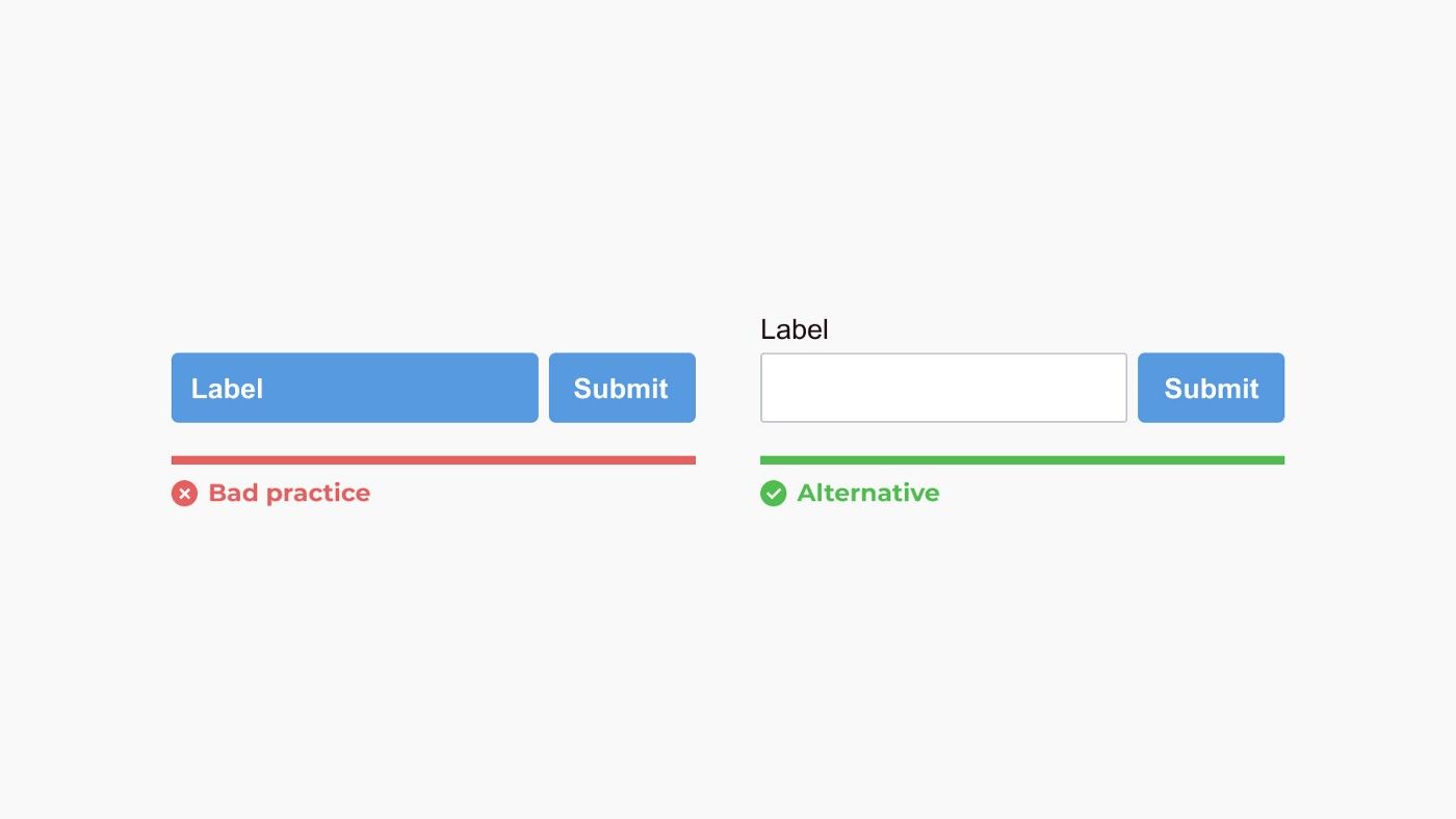
A form field should visually communicate its function. Make sure to add enough difference between other UI elements, so users don’t need to guess.
Use the appropriate input type and tag

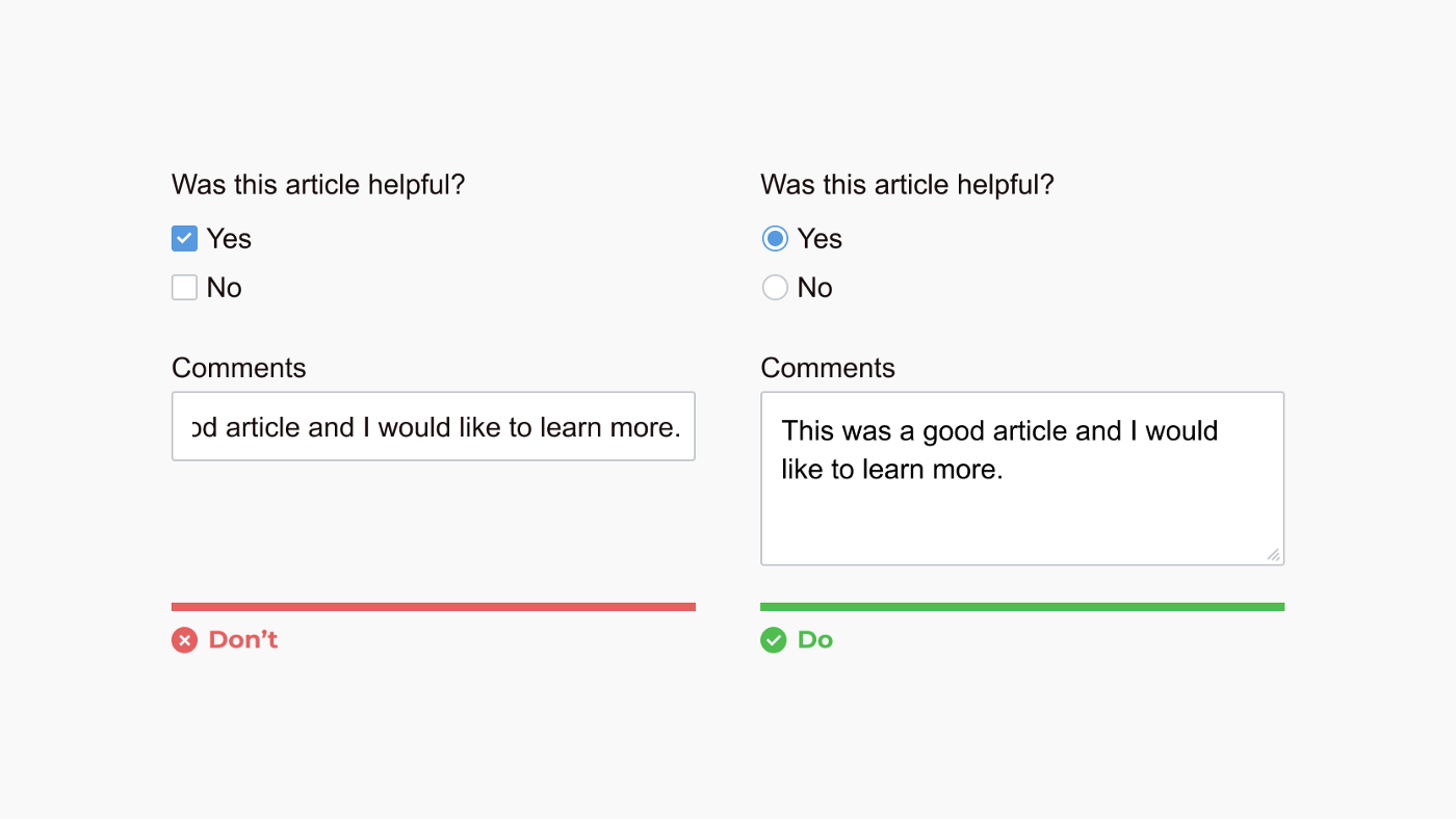
Input types make a form more accessible and enhance user experience. For instance, using the correct input type invokes the appropriate keyboard on mobile devices (numbers vs. letters).
Designers and developers often overlook simple things like using a radio instead of a checkbox for questions with multiple choices but only a single answer.
Forms should be one column

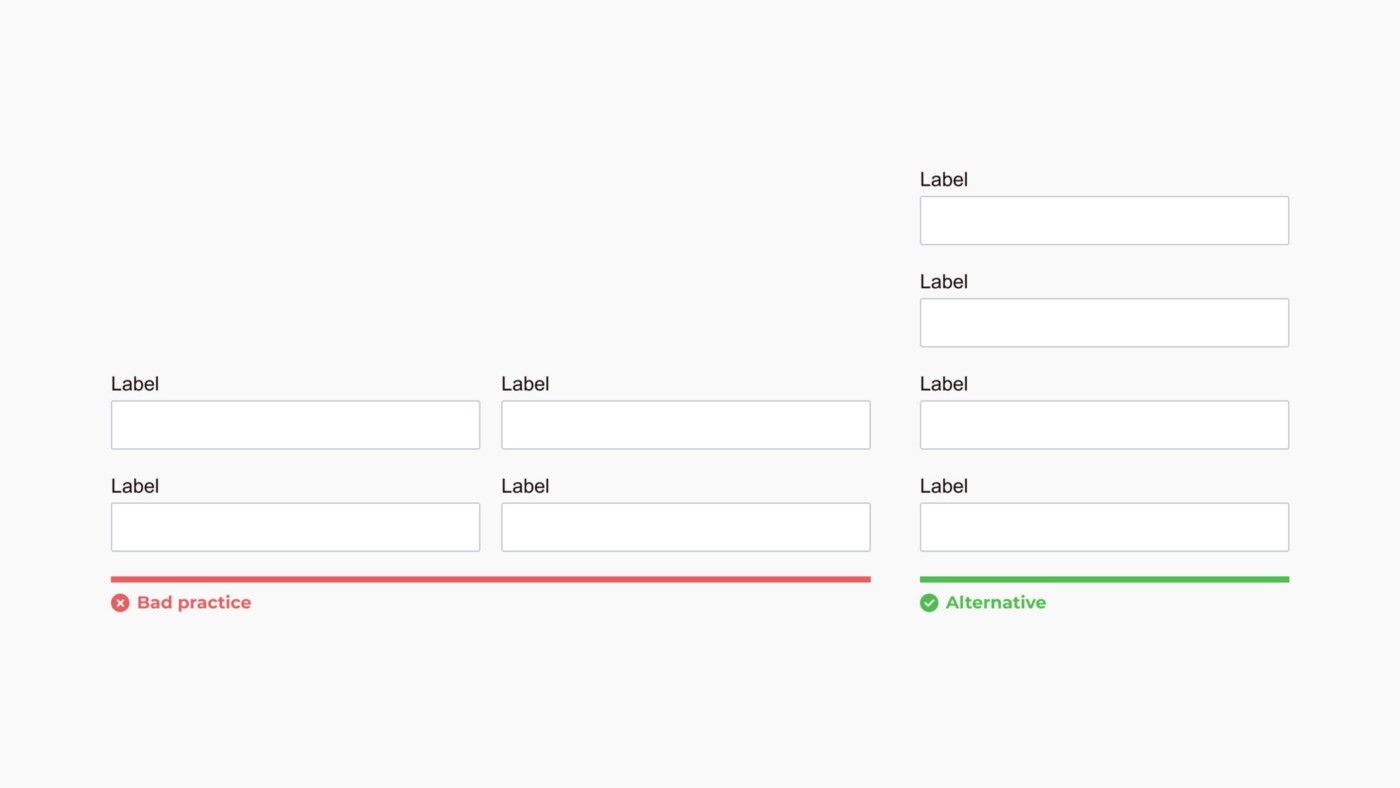
One-column forms are more comfortable to scan and conform better to mobile displays. Multiple columns can strain a user and cause them to skip fields accidentally.
Like most best practices, there are exceptions to this rule (like the next one on this list). Make sure to always keep in mind the context you are designing to determine the best presentation.
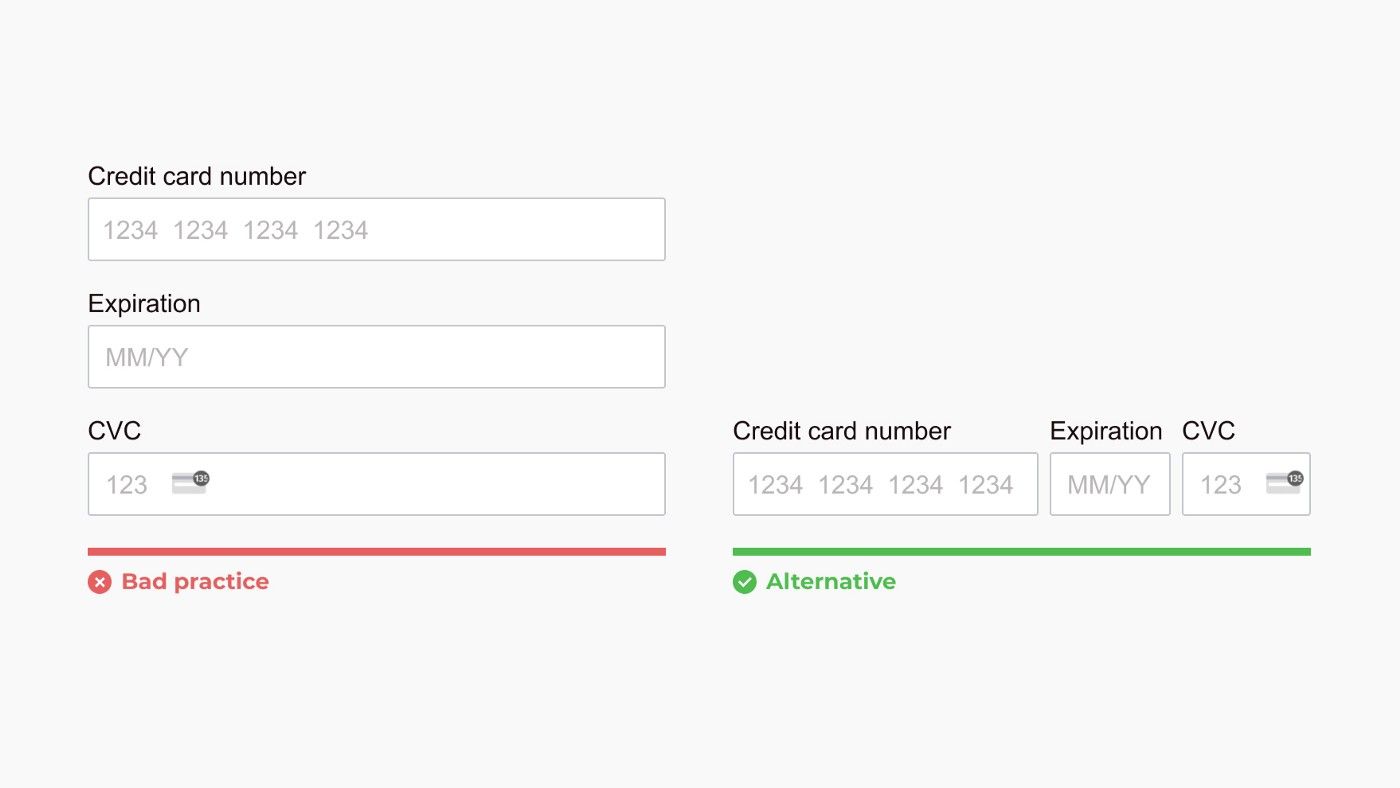
Fields that logically go together should be inline

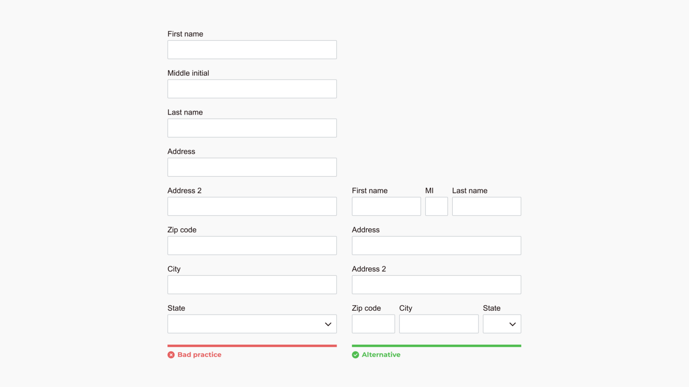
Stacking related fields like names, addresses, and payment info causes unnecessary friction and can break a user’s flow.
Omit unneeded fields

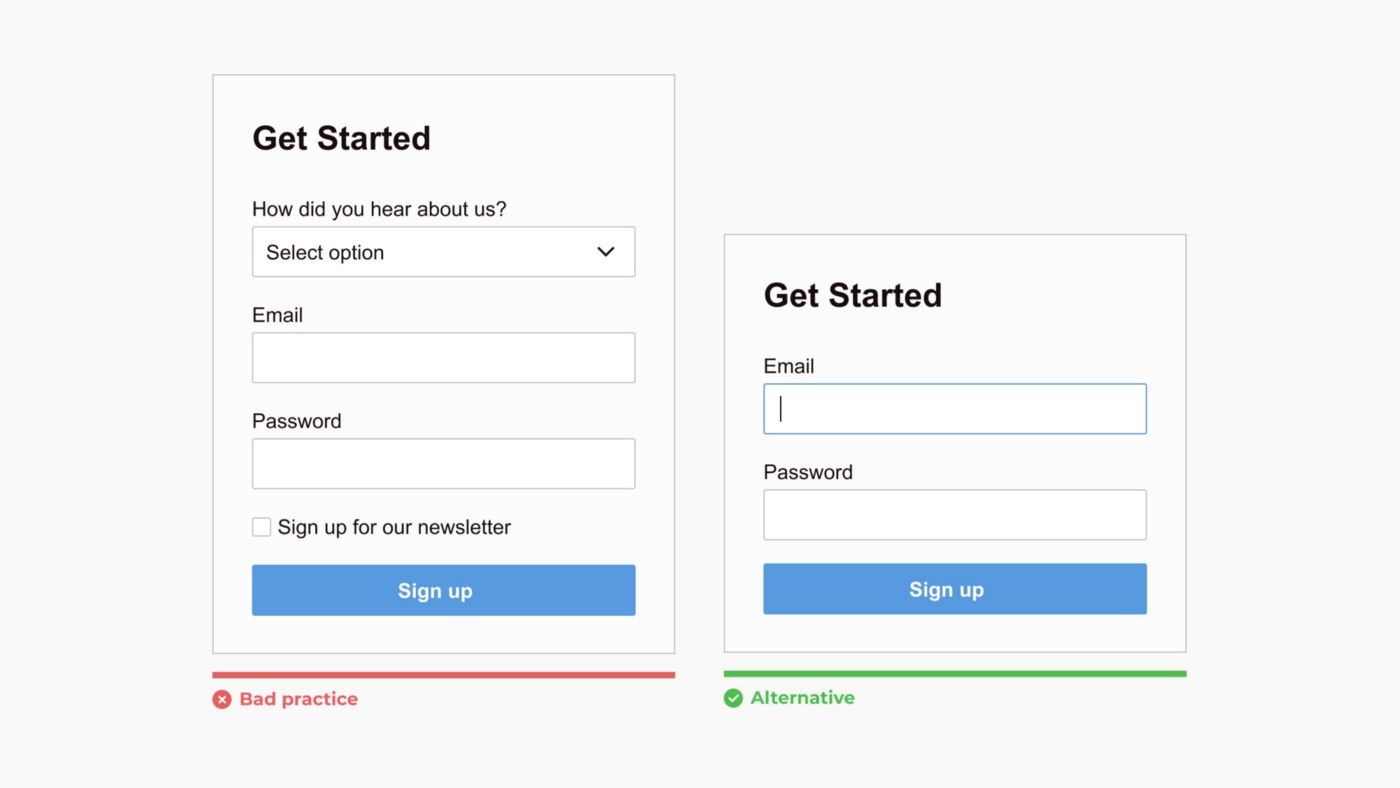
Omit optional fields and think of other ways to collect data. Always ask yourself if the question can be inferred, postponed, or completely excluded.
Make action buttons task-specific

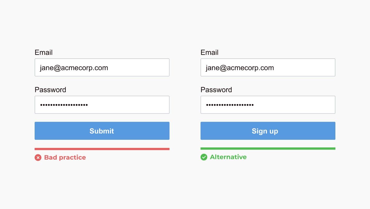
The submit button’s text should describe the action it will invoke clearly and concisely. A user should never be confused about what will happen once pressed.
Group labels with their inputs

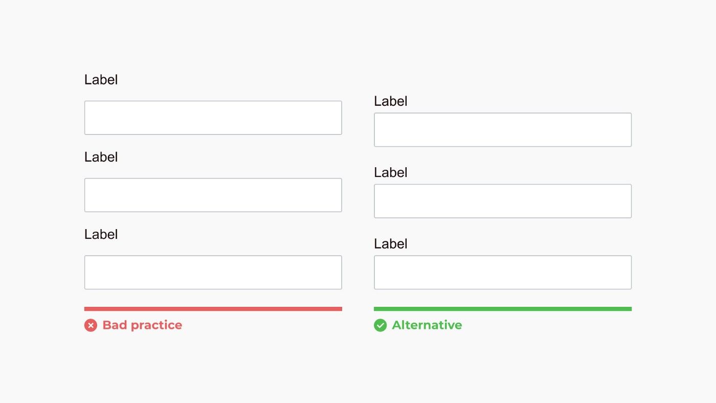
Present labels with their corresponding input so it’s clear to users which field they are filling out. Errors typically occur as a user scrolls up and down a page and makes an incorrect association.
Avoid all caps

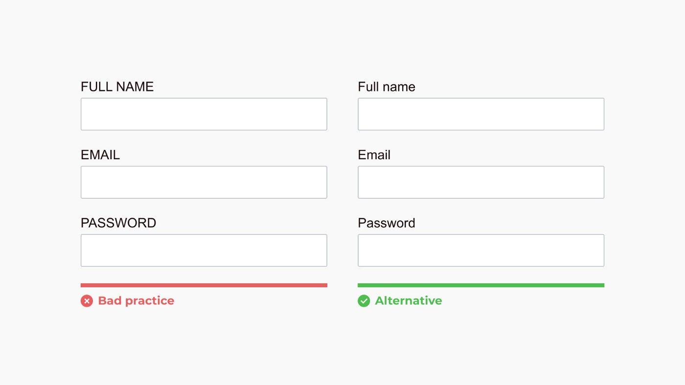
It is a matter of style between sentence case and title case, but all caps are never a good idea. All caps are hard to read, scan, and it just looks obnoxious.
Present checkboxes and radios vertically

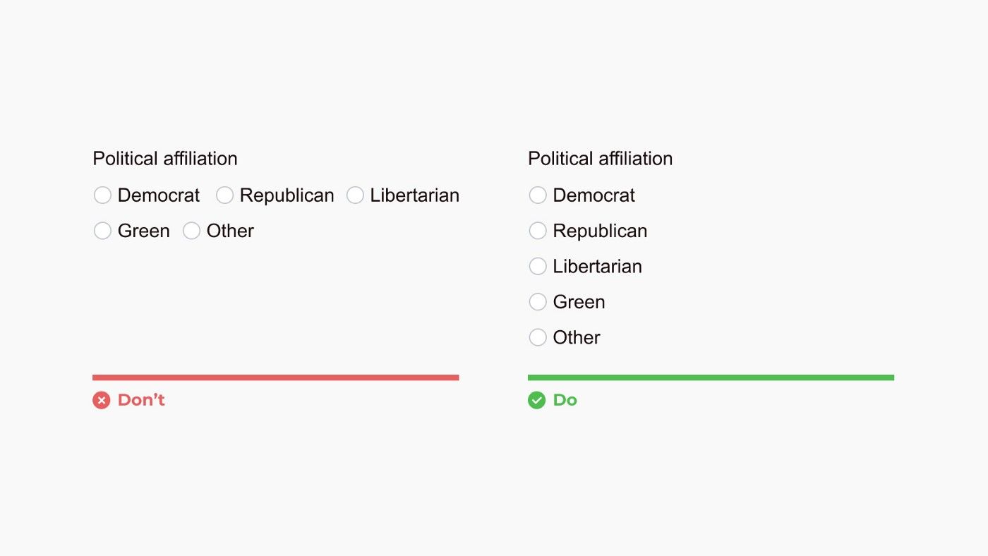
It’s easier to scan checkbox and radio options when presented vertically. However, presenting options with associated graphics can add an extra dimension to the design that negates the need for a vertical presentation.
Show all selection options if < 6

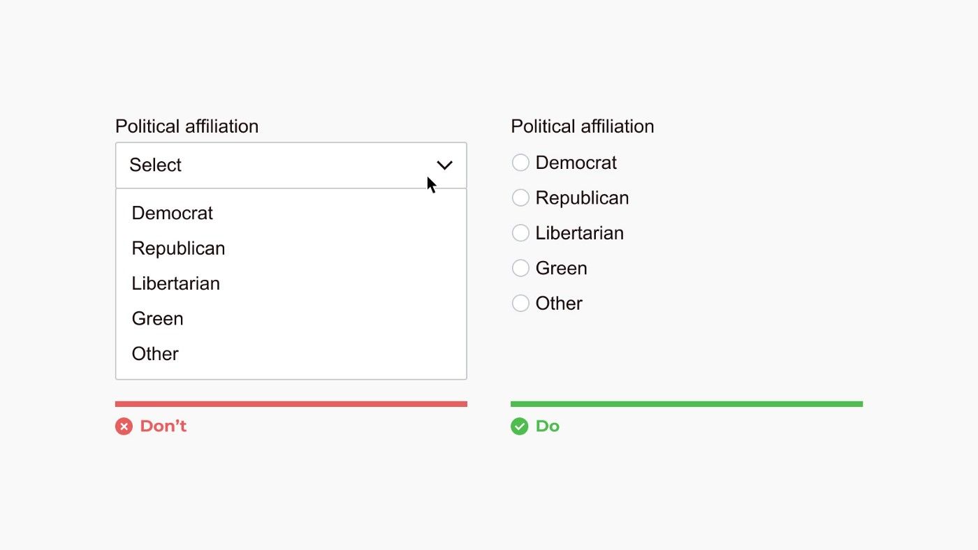
Placing options in a drop-down selector hides choices and requires two clicks to choose and option. Use a drop-down selector when there are over 5 options and incorporate search within the drop-down when greater than 25 options.
However, it’s okay to use a drop-down selector for under 6 options if space is limited, like in certain inline editing situations.
Show errors inline

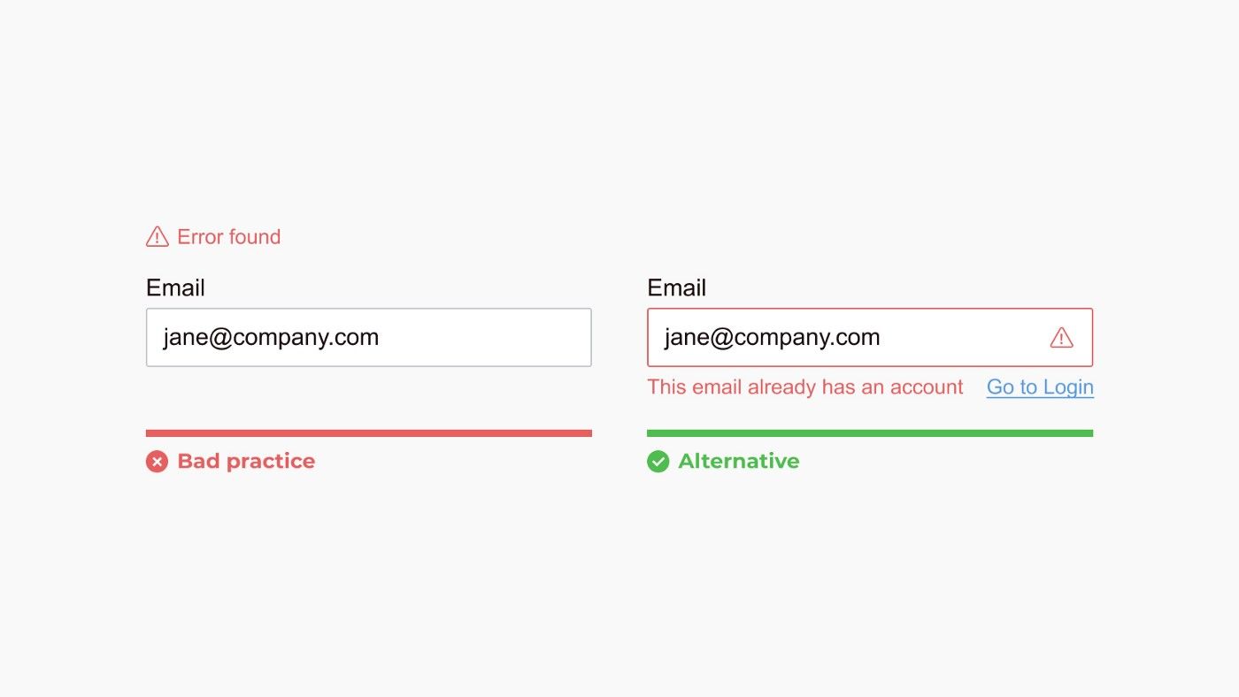
Try to prevent errors as much as possible by being clear and concise. When a user makes an error, show the user where the error occurred, provide a reason, and communicate how to fix it.
Group related fields

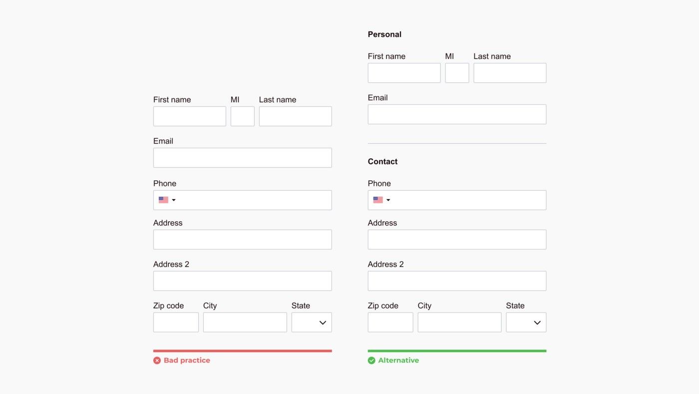
Create logical groups so the user can interpret what is being asked in the form faster and manage requests in batches.
Differentiate primary from secondary actions

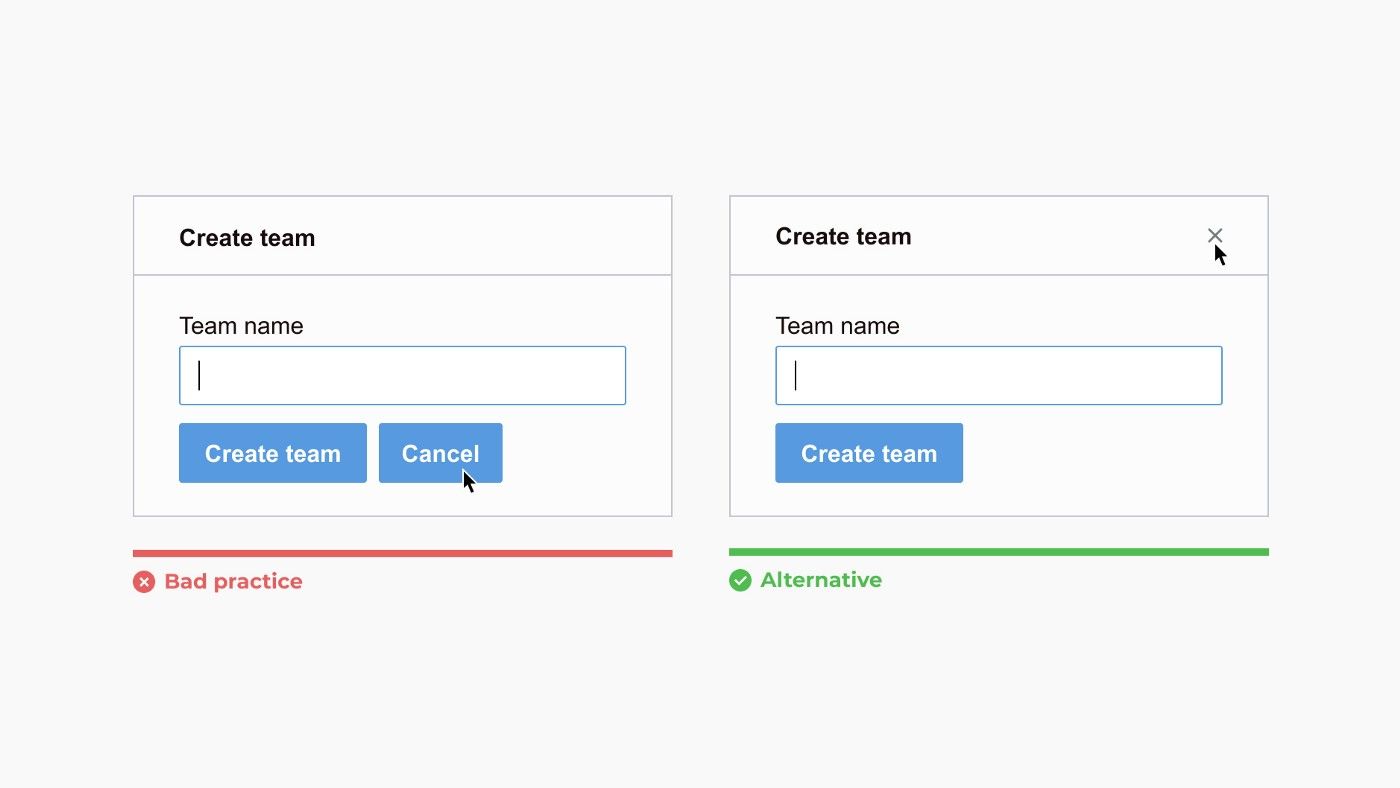
Make the main action of the form like submission more prominent than secondary options to avoid mistakes. And always ask yourself if the secondary action is even needed.
Incorporate an indication of progress for multiple-step forms

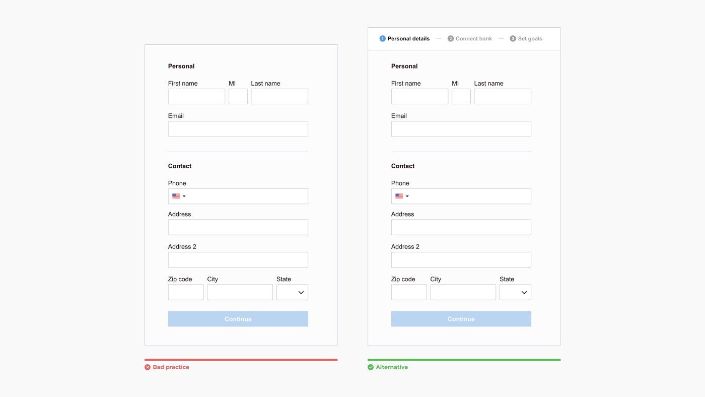
Multiple-step forms, aka form wizards, should indicate progress so a user knows where they are and what’s coming.
Resist modals on modals

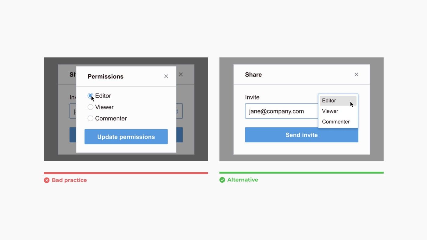
Interactions requiring multiple modals can cause user error. Consider inline editing within a modal instead.
Always think about accessibility
All too often, designers don’t check the implementation of their designs to make sure they meet accessibility benchmarks.
For more on how to semantically implement accessible forms, I highly recommend reading the W3C’s guidance on how to create websites that meet WCAG.